Advanced Composition & Design
Advanced Composition & Design is special topics course taught for the Digital Technology & Culture Program in the English Department at Washington State University. It is conceived as a sequel to the program's standard graphic design course, Composition & Design. Advanced Composition & Design reviews the fundamental elements of 2D design—such as shape, line, texture, color, and typography—and engages them at an intermediate to advanced level. Students are challenged to complete more in-depth and detailed projects, using the more complex principles of design, such as scale, balance, pattern, rhythm, and hierarchy. A major goal of the course continues to be the ability to see and to describe—and therefore to design—compositions in an abstract sense, using the visual language of graphic design. The ability to see abstractly is crucial for a designer, making him or her better equipped to estimate how visual choices may affect comprehension of a specific message. Emphasis is also placed on independent learning initiative for all stages of projects (research, exploratory work, technical expertise, etc.), as dictated by the individual solution a student wishes to engage for each project. For more information, see the PDF of the course syllabus and read student blog entries at the class wordpress site, and scroll down to see images of student work from the following projects:
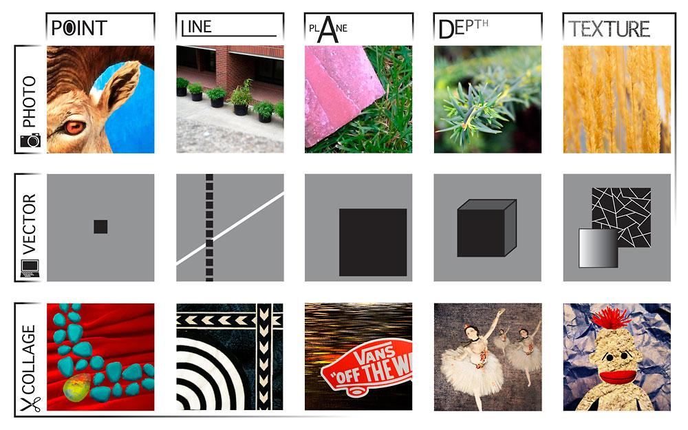
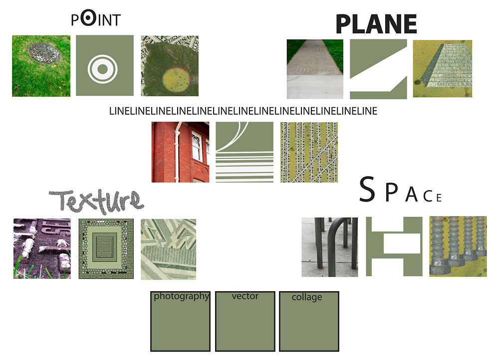
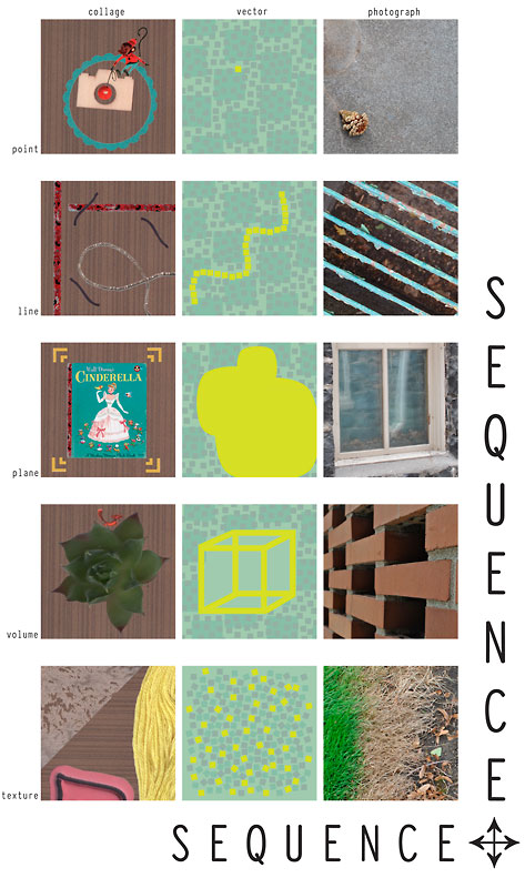
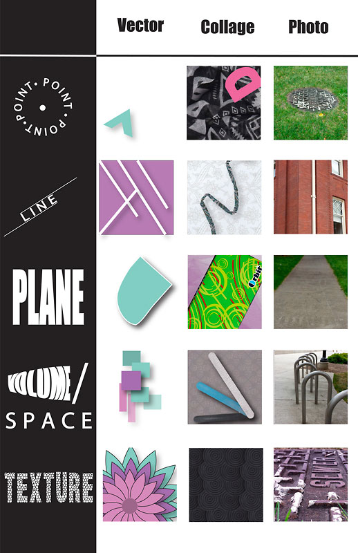
- Small Multiples / Multiple Media: Exploring Illustration and Information Visualization. Students create a series of visual sequences to illustrate basic 2D design elements, including Point, Line, Plane, Volume/Space, and Texture, after completing readings by Edward Tufte. (See Danielle Clement's Small Multiples blog post from this project as well as the full Project 1 description.)
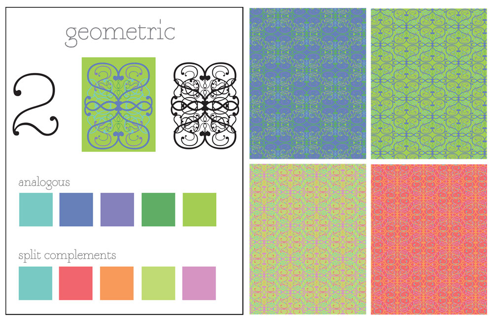
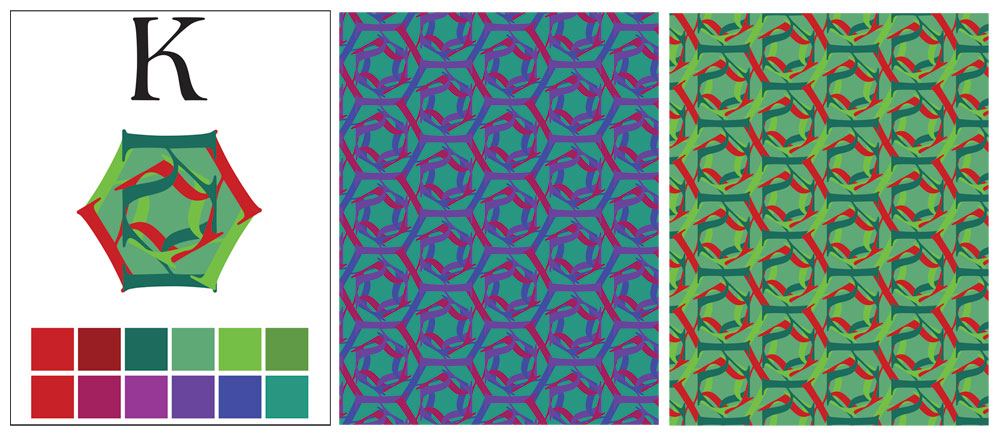
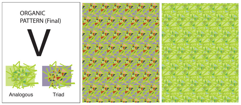
- Pattern Design and Color Relativity. Students explore geometric and organic pattern design, building visual complexity out of an elemental structure (in this case a single letterform), while also gaining sensitivity to the interaction of color and figure/ground relationships. (See Amy Koller's Pattern Design and Color Interaction blog post from this project as well as the full Project 2 description.)
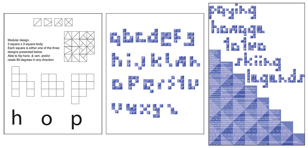
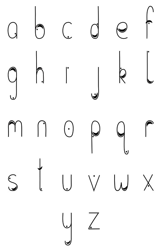
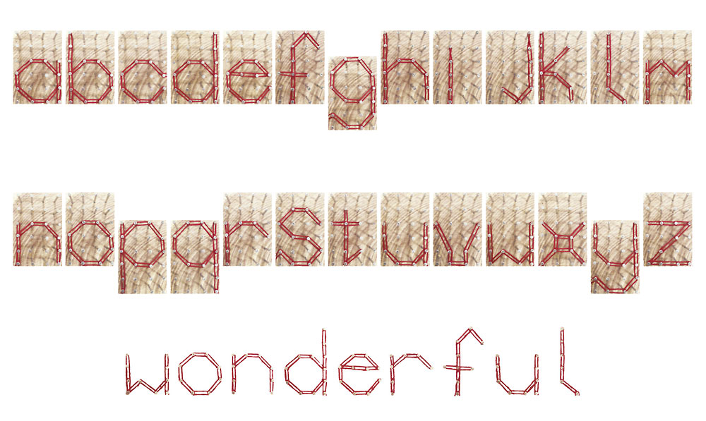
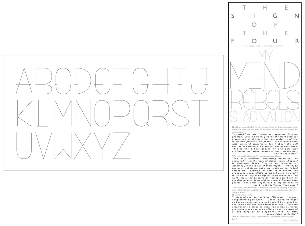
- Alphabet and Broadside Design. Using a text excerpt of their choosing for inspiration, students create a custom alphabet and then design a broadside to embody the spirit of the text. (See Lisa Gaviglio's Typeface Anatomy blog post, Kelsey Johnson's Broadsides blog post, as well as the full Project 3 description.)
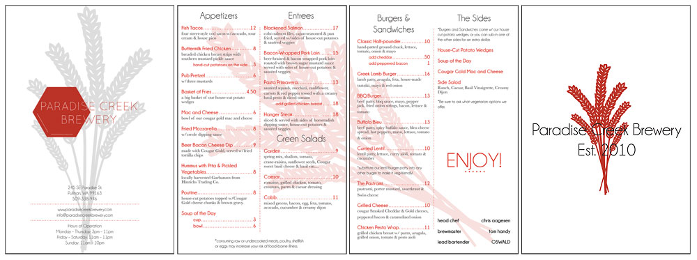
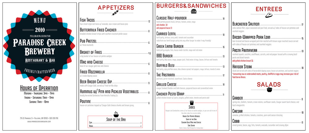
- Menu Design. Students analyze and redesign a menu from a local restaurant, with a focus on: typographic style and hierarchy; using a grid model for organization; color palette as it relates to food association; and paper choice and format for attractive yet economical printing. (See Karen Marten's student blog post from this project as well as the full Project 4 description.)
Click on any thumbnail below to begin viewing student work from this course in the image viewer.


Click on any thumbnail above to begin viewing student work from this course image viewer.